BEAUTY + STYLE
Pantone’s Color of the Year 2017 is Fresh and Natural
 Source: Pinterest
It’s been popping up in interior design showcases for the past few months, so it’s no wonder Pantone chose a green hue for their Pantone Color of the Year 2017.
 Source: Pinterest
The spring-like hue, aptly named ‘greenery’ is, according to Pantone “A fresh and zesty yellow-green shade that evokes the first days of spring when nature’s greens revive, restore and renew…Greenery is nature’s neutral. The more submerged people are in modern life, the greater their innate craving to immerse themselves in the physical beauty and inherent unity of the natural world.”
 Source: Pinterest
Possibly due to the tumultuous election we have just been through, there has been a leaning towards creating calm, peaceful and minimalist environments in our home and Pantone’s shade of green evokes just that. As Pantone’s executive director, Leatrice Eiseman reveals, “Greenery bursts forth in 2017 to provide us with the reassurance we yearn for amid a tumultuous social and political environment…Greenery symbolizes the reconnection we seek with nature, one another, and a larger purpose.”
 Source: Pinterest
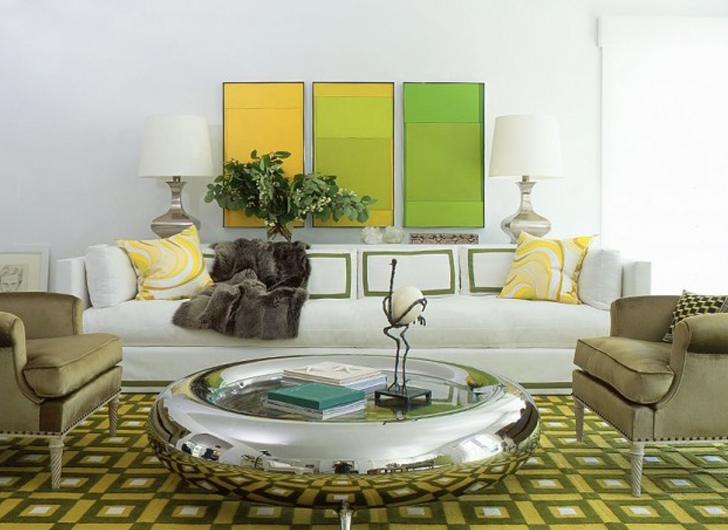
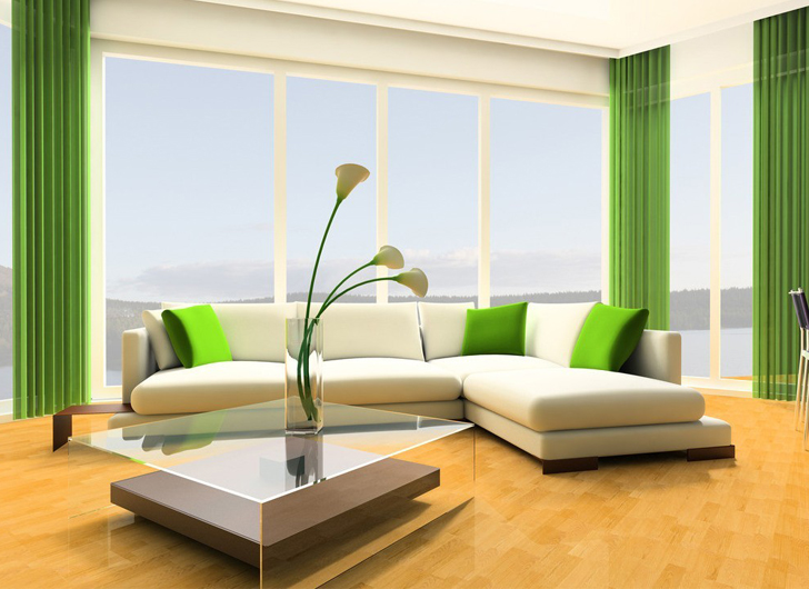
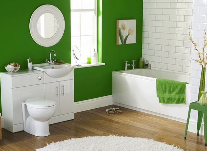
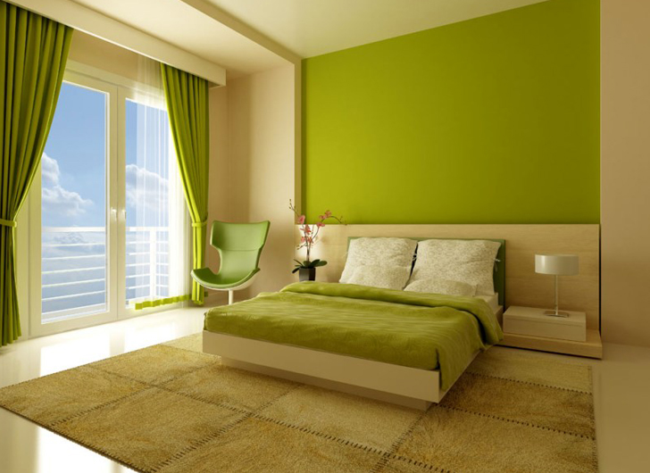
Greenery makes perfect additions to the home in a supporting role. Try adding this hue in scatter cushions, drapes, linens, vases, kitchen ware and decor. Pick out one wall to paint in this fresh shade, or frame black and white photographs in green to make them pop against a blank wall. Paired against white, the hue looks fresh, simple and full of spring vitality.
About Lifestylogy
Lifestylogy provides our community with the latest trending health, fitness and wellness news from around the world. Our expert lifestyle team explores ways to promote positive stories, photos and videos. We are inspired to share our incredible insight and motivation with all lifestyle enthusiants to help live your life to the fullest.


ADVERTISEMENT
ADVERTISEMENT

LIFESTYLEApr
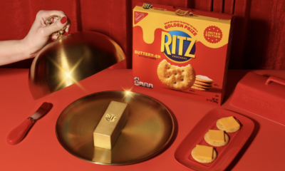
Ritz Launches New Buttery-er Cracker By Giving Away Gold Bar Shaped Like A Stick Of Butter Worth $100,000
Ritz is celebrating the launch of its new limited-edition Buttery-er Flavored Crackers by offering fans the chance to win a...

CELEBRITYApr
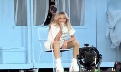
Sabrina Carpenter References Infamous Saltburn Tub Scene In Nonsense Outro, Likely Nod To Partner Barry Keoghan. Coachella Weekend 2. (4/19/24)

CELEBRITYApr
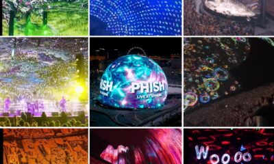
Phish at Sphere in Las Vegas – Vivid Scenes. 4/18/24 to 4/21/24.

CELEBRITYApr